I’m Jakub Jonáš, a graphic designer located in Brno. I can design anything from logo & corporate identitiy, banners and billboards to video, animation, and web. I’m in love with minimalism.
works.
about me.
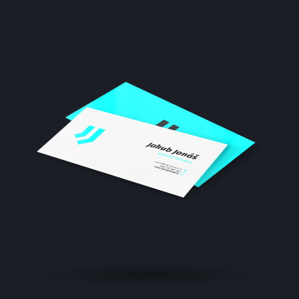
Jakub Jonáš
I’m 31 years old graphic designer living in Brno, Czech Republic. I have over 10 years of experience in graphic desing and I was freelancer for the most of this time. I was part of creative agency www.smeczka.cz for 6 years and in 2021 I joined www.better.cz. I’m working there on a position of Art director for over 2 years now. I graduated from Masaryk University, my field of study was Theory of interactive media. I specialize in creating logos and complete visual identities. But i can desing almost everything including banners, billboards, web, animation and video. I worked with clients like Stihl, Scania and GrowJob. Minimalistic style is my own, both in design and in life. My favourite motto is “Less is more“. In my free time I like drawing, sports, movies and spending time with friends.
Adobe Illustrator
Adobe Photoshop
Adobe Indesign
Adobe After Effects
Figma
Creative passion
creative process.
1. research
Thorough research of assignment and undesrtanding the requirements. Analysis of customer’s business and possible competition. Clearing all ambiguity and setting main tasks of design.
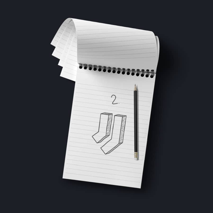
2. sketching
Brainstorming, creation of various concepts and sketching them on paper. Assembling moodboard and selection of best candidates.
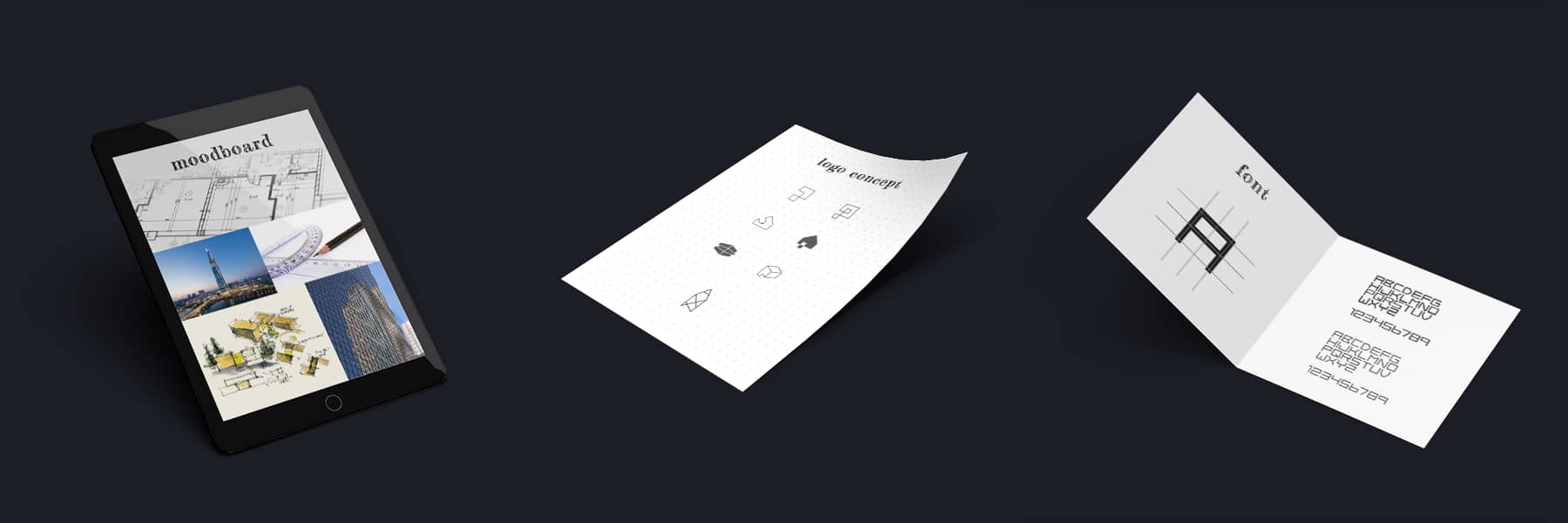
3. digitalization
Transfer of sketches from paper to digital form and their tuning. Application of colors, choosing fonts and experimenting. Presentation to a client and adjustments based on the feedback.
4. finalization
Final adjustments to design. Preparation and handover of results in all formats agreed on. Final payment and possible continuation of cooperation.
case study.
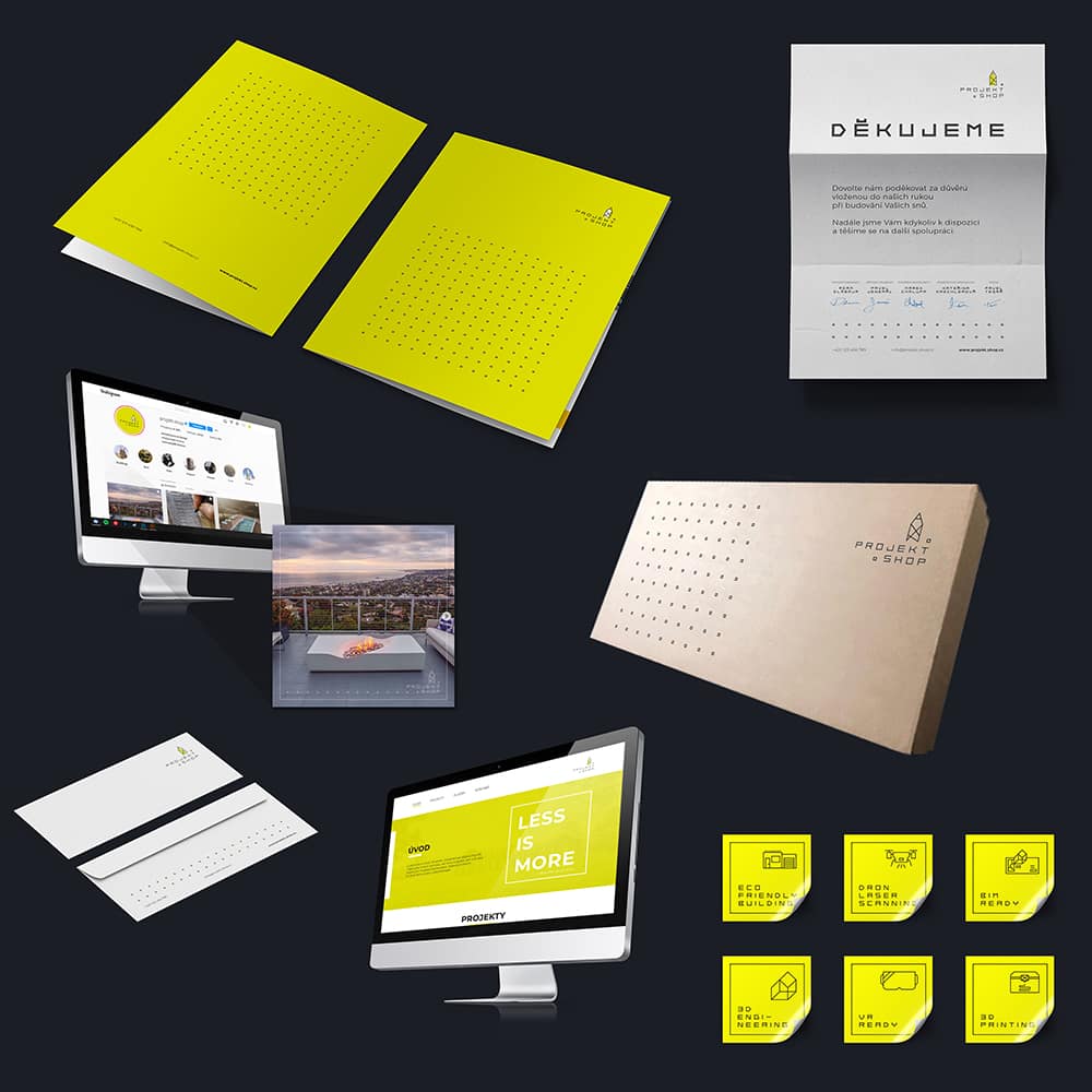
projekt.shop
Designing complete corporate identity for newly created construction company that specialize on creating complex architectonic projects. Main goal was to express youthful energy, ability to utilize modern technology like 3D printing or virtual reality and also focus on ecology.
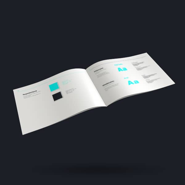
In the first phase I designed a logo, however I already had an idea about utilizing individual elements in complete corporate identity. Symbol of a logo represents and combines a pencil, building and drawing. Fresh green color encourage perpetion of a brand as progresive and unique, with care about nature. Main shape that appears everywhere in a project and define it is a square. It’s reference to modern architecture and construction drawings. I designed a custom font for this project, one that has individual letters in square shapes and is organized in a grid. Small square dot from a company name is used in different shapes on every material and connects them together into one coherent design.
I designed a whole range of materials from t-shirts, cups and business cards to envelopes, instagram look, web and stickers.